I've given a Lunch & Learn session 🍚⏲️ at my company to talk about Atomic Design and how it is related to the React library. The responses were great, so I decided to transcribe the most important concepts covered in my talk into this article, and re-write for #CodeNewbie.
I made a public version of those slides which you can look through here, if you wish to have more media to complement your reading ✨
Why you should know Atomic Design
According to Bradfrost's book on Atomic Design, some benefits of pattern-based design that are created based on Atomic Design concepts are:
- They promote consistency and cohesion across the entire experience.
- They speed up your team’s workflow, saving time and money.
- They establish a more collaborative workflow between all disciplines involved in a project.
- They establish a shared vocabulary between everyone in an organization, including outside vendors.
- They provide helpful documentation to help educate stakeholders, colleagues, and even third parties.
- They make cross-browser/device, performance, and accessibility testing easier.
- They serve as a future-friendly foundation for teams to modify, extend, and improve on over time.
All of these are very helpful for software projects, but what is Atomic Design?
Introduction: What is Atomic Design?
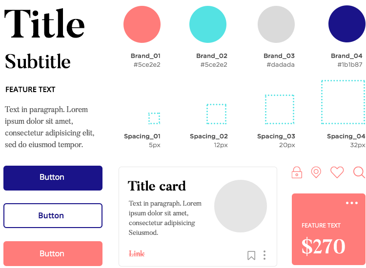
Atomic Design is a design methodology proposed by Bradfrost in June 2013 to create design systems. A design system is a set of standards that components have to comply to. Some standards include sizes, colors, padding, margin and relative positions to other components.
 An example retrieved from Justinmind
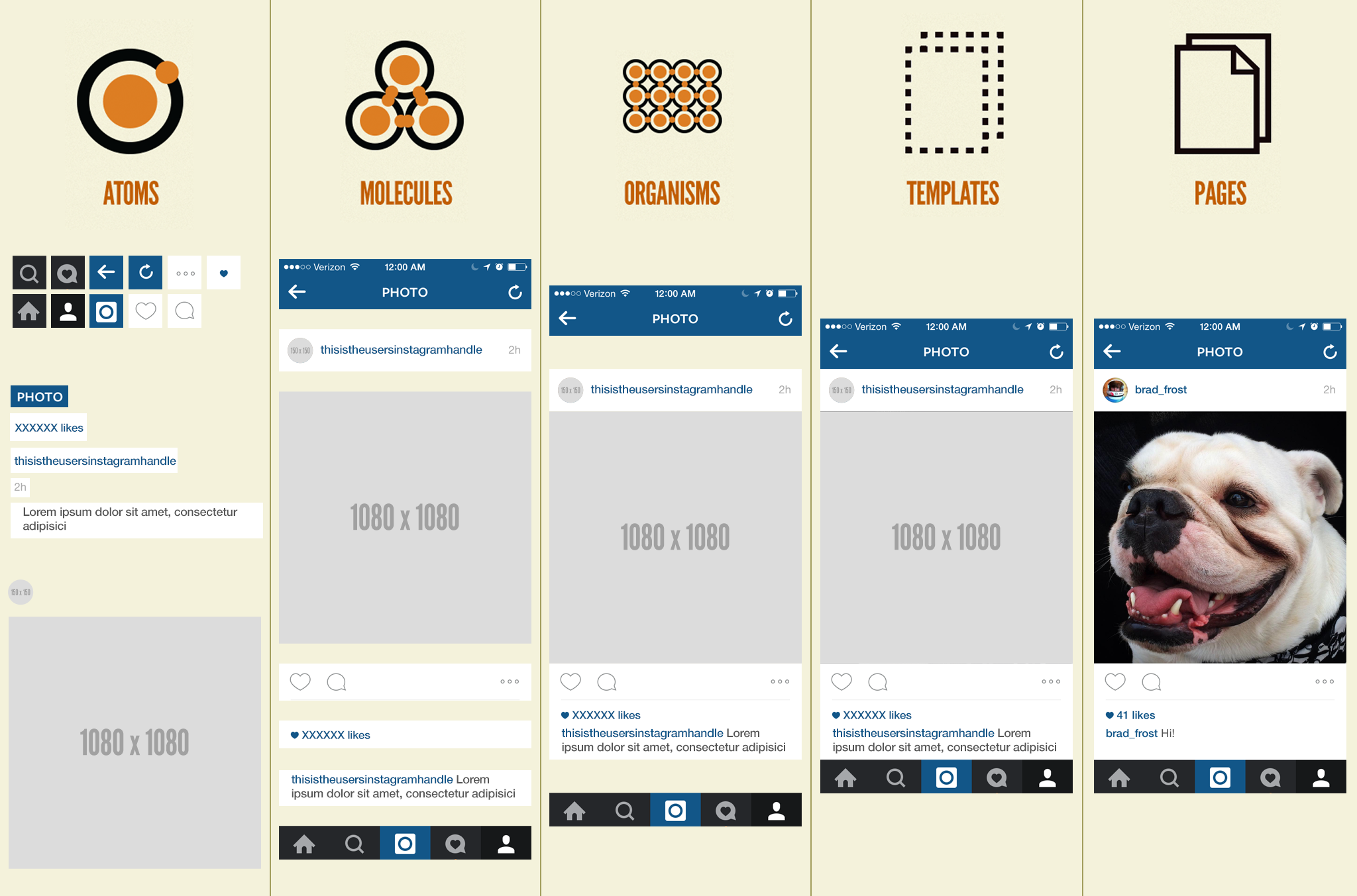
In Atomic Design, there are 5 distinct levels of components
Instead of fixating on the definition of what each level is, have a look at the image that Bradfrost made in Chapter 2 of his book on Atomic Design that directly illustrates what components are at different levels and how the components at the next level are made by composition of components from the previous level.

This also relates to the Component Hierarchy concept found in many component-based frameworks and libraries such as React, Angular and Vue. Determining what kind of components are necessary to build a feature will allow you to reuse the same components easily to form templates and create different pages.
Now that you know what is Atomic Design, there are 3 main reasons why you should know about Atomic Design specifically as a developer.
1️⃣ Atomic Design concepts helps to improve your requirement analysis and effort estimation skills 🧠
Every developer has their own way of coming up with their own requirements of what the deliverables of their projects should entail, but not every developer is effective in giving good estimates of when they can finish those specific projects. Requirement analysis and effort estimation are separate skills gained only through deliberate practice.
By deliberate practice, I mean that you have to practice articulating and presenting to someone else your opinions on how you or the team is going to work on the project within a specific time. Coming up with a rough list of all the requirements of a project and grouping them into specific milestones are what Product Owners would refer to as delivery goals. After that, the requirements within each milestone could be categorised further into specific features or domains. That way, it will be easier to gauge what can be done within a number of months, weeks or days.
Including Atomic Design concepts will help you craft a better perspective in understanding better how to break down big features into smaller ones, especially for frontend development. You can think in terms of Atoms, Molecules, Organisms for building the feature. Then for a more coherent system and codebase, you would think of the components you build in terms of Templates and Pages. Hence it will also be easier for you to perform requirement analysis for the bigger picture perspective of the entire feature, which also helps you to estimate the effort for each of the smaller tasks better.
2️⃣ Identify the composition of components
Some terminologies to be aware of:
A parent component is defined as the component that composes of the child components
  <div id="parent">
      <button id="child" />
  </div>
Sibling components are those that are at the same hierarchy level.
  <div id="parent">
      <button className="sibling" id="child1" />
    <button className="sibling" id="child2" />
  </div>
Now let's look at a component at the Organism level.

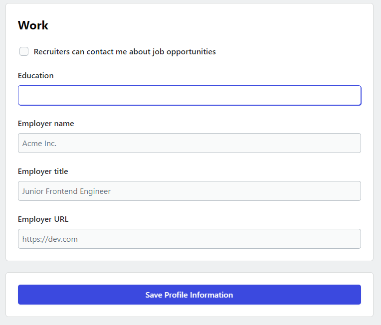
Example of a partial form extracted from CodeNewbie's profile settings
In a form, you may have
- a title for your form,
- a few labels with their input fields,
- followed by a submit button.
In this case, the obvious observation would be that: the form element is the parent component at the highest level, while the composition of its child components is not immediately clear. However, we will be able to identify that there are recurring patterns of certain components
- label
- input field
being repeated for 4 times in this form.
This will be a good indicator that these can be reusable components. In fact, the label and the input field are different atoms that can be combined together to form a molecule of a form input field.
Now let's look at the CodeNewbie's profile settings in full:
(note that the label is omitted for brevity)

Now that we have the whole profile settings form, we can see even more recurring patterns:
- title
- text area form input field (w/ label)
- color picker (w/ text input form field)
- section container
As to which ones are the atoms, molecules, organisms, i think you would be pretty familiar by now 😁 Being able to identify which components are children, and which components are the parents, we could also have a more organised way of structuring our codebase.
src/
└───pages/
│   └───ProfileSettings/
│                └───components
│                    └───ColorPicker
│                    └───ImageUpload
│
└───components
    └───Label
    └───TextInput
    └───TextArea
    └───Title
    └───Section
- Since the ColorPicker and ImageUpload components seem to be used only at the Profile Settings page, we will put the page-specific components under
src/pages/ProfileSettings/componentsfolder. - For more components that are used on different pages, they can be in the
src/componentsfolder. If later the ColorPicker and ImageUpload components are used as well in other pages, then we can just move them out to thesrc/componentsfolder.
Of course this is just one way of structuring it. You can structure it any way else that makes it clear for your development team to easily navigate the project and reuse them so they don't have to spend effort to reinvent the wheel for something that actually already exists.
3️⃣ Collaboration with other roles 🤝
Recall that
- Atomic Design is a design methodology for creating design systems.
- A design system is a set of standards that components have to comply to
As a software developer, depending on the company you join, the scope of your responsibilities differ. In bigger companies that could afford more manpower, you could have
- PO to lay out delivery goals and requirements
- BAs managing the task of requirement analysis and prioritisation
- UXUI designers in charge of designing the components' mockups before you implement them
- QA to perform more testing of the components you implement
That also meant that a design system is also a set of standards that different roles have to abide by, not just developers. Hence, a design system is also a collaborative responsibility.
That is where the impact of applying Atomic Design concepts and achieving 1️⃣ and 2️⃣ comes in. With better technical competence to perform requirement analysis and break down tasks, followed by giving good effort estimates to your teammates, you will be able to communicate better to other developers AND other roles how the team works together on delivering parts of a product.
Conclusion
To conclude, these were the 3 points mentioned for why you should know about Atomic Design concepts as a developer:
- Improve your requirement analysis and effort estimation skills
- Helps you to identify the composition of components
- Helps you to collaborate with other roles better
And if you would like to have a real small demo project to apply these concepts, you can head over to my article on how to navigate the frontend easily :sparkles:
Thank you very much for reading this article! 🌟
Leave reactions 💌 if you enjoyed it!
Please give me some feedback below 👇 be it how you feel after reading this article or if you have any other questions!
