Creating Tooltips with Tippy.js | My learning experience and why you should use it
First off, what is a Tooltip?
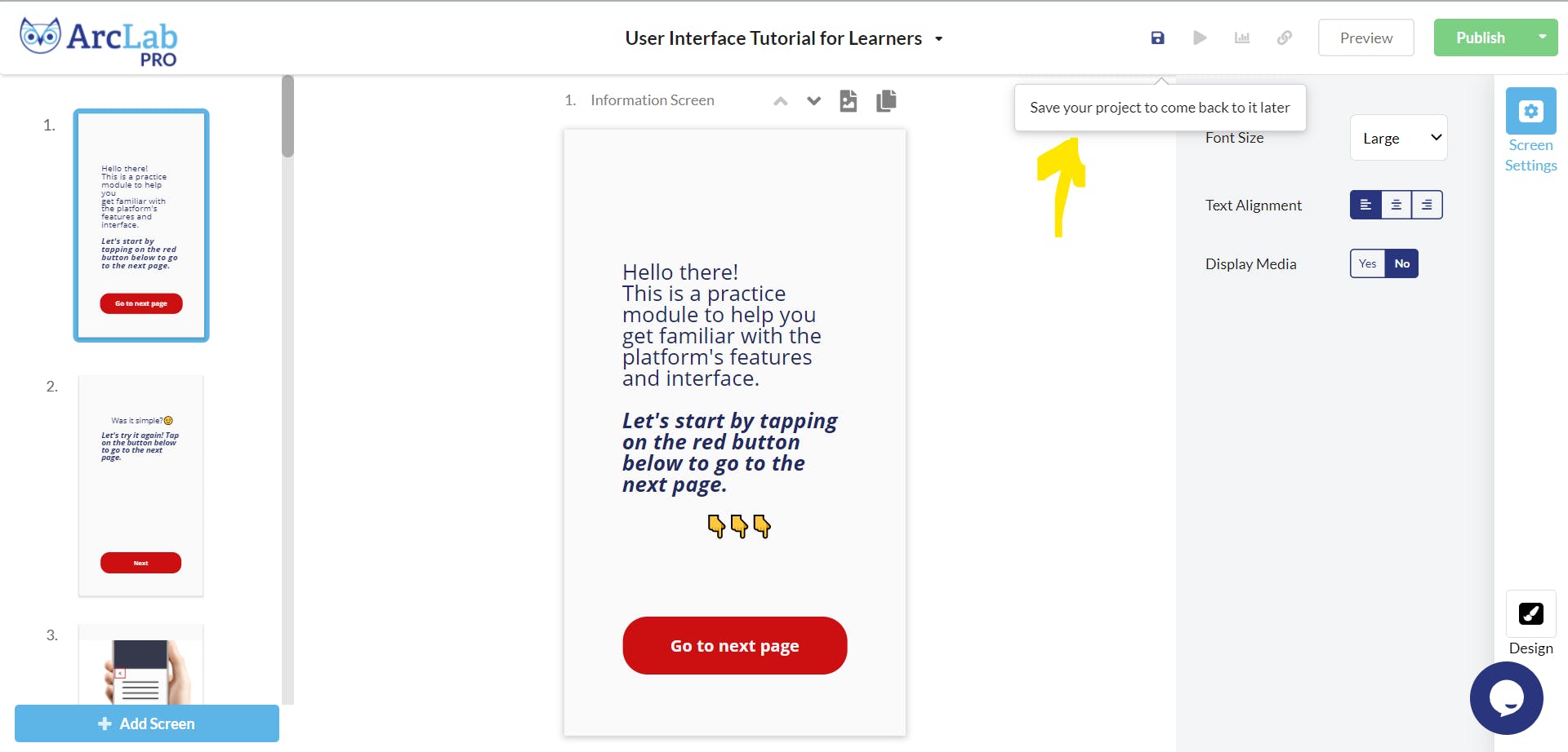
A tooltip is a form of popup UI that serves to give more information about a particular component of subject matter. You might see them around in some websites that prefer to use icon buttons to reduce mental load of their users when reading the website. An example is below.

This example is taken from a product known as ArcLab's builder platform, which serves to be like a microsoft powerpoint tool to create interactive 'slides' but intended for mobile users. Some of the controls look vague in what they do, so they included a tooltip for the icon buttons at the top right. This helps first-time users to get a sense of what the buttons will do.
Now that we know better what tooltips are, how do we create them?
The problem of creating tooltips from scratch
Although it is possible to code a tooltip using just CSS and vanilla JS, there are a lot of considerations that are highlighted by Popper.js , the positioning engine that Tooltip.js is based on.
The considerations for only using pure CSS to create popups that would cause you to be bald include:
- Clipping and overflow issues
- Handling automatic flipping
- Ability to contain interactive HTML in the tooltip/popup
- Virtual positioning
and for why using vanilla JS by yourself is also a pain:
- When tooltip is attached to an element in Scrolling containers
- Performance issues
- Tooltip to be able to move outside DOM context
- Code size required to create just the popup/tooltip alone
Painful, isn't it? Well, if you are adventurous enough, you could try tackle some or all the problems there and create your own tooltip library. But for now, thankfully there is Tippy.js for an easy bootstrap!
Basic Demo
Following their " Getting started page ", I created a very simple demo below, which shows the tooltip whenever I hover over the diamond. It requires minimum code and looks good.
And then I realized that there was a cooler idea that I wanted to try with tippy 💡
Advanced Demo
I would like to be able to :
- show a tooltip whenever I select text in a paragraph
- display the number of characters that are selected in the tooltip
Here's a preview of the implemented idea
Challenges in implementing the advanced demo
However, I actually met quite a few challenges in trying to manifest the idea.
Challenge 1: Adding tooltip to an existing element
The simple demo above only allows for adding of tooltip to an existing element. So I was initially confused on how to make it exist only when text is selected. Later on, I realized that I could make a random div for the tooltip to be attached to #tooltipContainer, and move that div anywhere I want near the highlighted text.
Challenge 2: Obtain text from selection
While I vaguely know that I have to add event listeners to show and hide the tooltip when I select the text. However, aside from the ::selection pseudo-element to style the text, I didn't actually know how to actually grab the selected text if there is any. So I googled around and eventually found the document.getSelection() method. From there, I also check what the Selection class provides for me to utilize to create the tooltip appropriately, to create the following function to show the tooltip whenever the user does a mouseup event after selecting some text only in the specified container (I didn't want the tooltip to popup on selecting the instructions text)
document.getElementById("textContainer").addEventListener("mouseup", () => {
    let selection = document.getSelection();
    if (!selection.isCollapsed) {
        const {
            left,
            top,
            width,
            height
        } = selection.getRangeAt(0).getBoundingClientRect()

        tooltipContainer.style.left = `${left}px`
        tooltipContainer.style.top = `${top}px`
        tooltipContainer.style.width = `${width}px`
        tooltipContainer.style.height = `${height}px`

        const numLetters = selection.toString().length;
        instance.setContent(`Great Job! You selected ${numLetters} charcters!`);
        instance.show()
    }
});
This chooses the first selection area and get coordinates of the bounding rectangle around the highlighted text so that we can place the tooltip container only at the bounding rectangle. Tippy is smart and somehow knows to place itself at the center top of the rectangle by default 😁
And for removing the tooltip entirely after the user clicks outside of the selected text
document.addEventListener('mousedown', (event) => {
    instance.hide()
})
I was pretty satisfied with how I could reach this progress until...
Challenge 3: Tippy instance undefined
I kept getting undefined for the tippy instance that I created in the .js file, and I had no idea why because I followed Tippyjs documentation on the instance and the below instance always gave undefined when the event listener is called.
const instance = tippy('#tooltipContainer', {
    content: 'tooltip',
    sticky: true
})
This took very long to debug and later on, then I realized it's because somehow the reference to the object kept disappearing... So instead of the above I had to do
const [instance] = tippy('#tooltipContainer', {
    content: 'tooltip',
    sticky: true
})
If any Javascript expert can explain this, that will be cool 😉
Challenge 4: Tooltip does not refresh
There was a weird bug where I clicked outside of the selection text to deselect, and it still shows my previous tooltip if I hover around the previous area. I looked at the documentation and changed the .show(), .hide() to .enable() and .disable() instead, and it helped.
But now, even though the tooltip no longers show at the last de-selected text area, I cannot select text normally at the de-selected text area. Upon inspecting, it is because my #tooltipContainer is still blocking the paragraph, so I had to make the final adjustment of setting the width and height to 0.
Combining both, the new functions look like this
document.getElementById("textContainer").addEventListener("mouseup", () => {
    let selection = document.getSelection();
    if (!selection.isCollapsed) {
        // ...
        instance.enable()
    }
});
document.addEventListener('mousedown', (event) => {
    tooltipContainer.style.width = `${0}px`
    tooltipContainer.style.height = `${0}px`
    instance.disable()
})
Implementation
Eventually, I did it! 🥳
With Tippy.js, it helped to take away a lot of effort in thinking and attempting on how to create the tooltip itself, and it allowed me to focus on learning the other aspects on manifesting the advanced demo idea.
If you like to see the two demos together, visit this GitHub page.
Inspiration
As a side track - why did I come up with this idea anyway? While I was thinking of a side project to do, and having a feature of an interactive tooltip with the user's selected text is part of that side project 😆 I also wanted to brush up on my fundamentals on Javascript by using only vanilla JS with no shiny framework. Having said that though, for that side project, I will be converting what I have here to a React implementation hehe. Stay tuned!
EDIT: a follow-up article is now available here which includes other useful tips for working on a side project too.
That's a wrap folks! 🎉

Thanks for reading the article!
If you enjoyed reading it, react, feedback and follow me here and Twitter ! 🌻🐦

