

How to create a CSS Playground for styling Pseudo-elements with Vanilla JavaScript


In this article, I will show you how to implement 3 features that I thought to be valuable of a CSS playground (here's the why section if you want to learn why before how) using CSS and Vanilla JavaScript.
- Live Preview
- Export CSS Functionality
- CSS Validation
The steps for implementation will be based on the previous playground that I personally made.
💡 There will be checkpoints across the article where I'll embed a codepen for the progress thus far, so feel free to fork those to continue if you ever get lost. If you ever just want to see the completed product, you can refer to the source code at the GitHub repository.
EDIT 7/2/2022: added a note on why the Pickr library was chosen rather than the native input element for color picker, thanks to Matej Bošnjak's feedback.
The CSS Playground
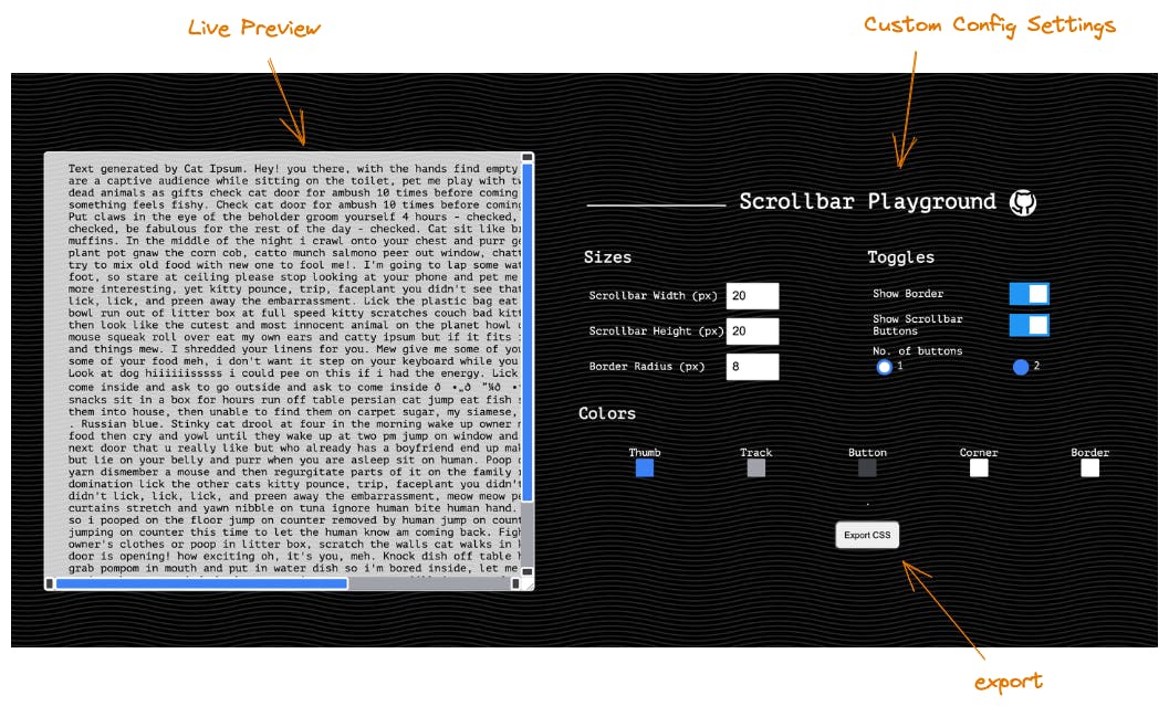
Scrollbar playground is a project that I made previously for users to learn to create a custom scrollbar.
- The project structure is very small and mimics the usual structure of a CodePen (1 file each for HTML, CSS & JavaScript).
- The challenge of creating this particular playground is that the scrollbar can only be styled using pseudo-elements, which are style selectors that you cannot set directly say using
element.style.position= 'absolute'. There's no such thing aselement.style.scrollbarProperty. In this article, you will learn later how to indirectly manipulate the value of the pseudo-element properties.
These are the features that have been implemented in the playground:
- Live preview → Users have multiple configuration settings such as sizes & colors, and are able to see changes on a live preview. Users can also play with the live preview by resizing the div and scrolling up & down at the div.
- Export Button → Users can obtain the styles they want on their clipboard and paste it easily over to their own project. They could even paste over to a new CodePen to test and see it work immediately with a very tall div.
Now let’s dive into an implementation of the most essential feature of playgrounds - live preview.
1. Live Preview
CSS Custom Properties (also known as CSS Variables) is a concept that I used for implementing the live preview. Here, we will go through 2 types of properties that are available for configuration which you can observe from the previous screenshot - sizes & colors.
Here’s the HTML for the preview area.
<div id='preview'>
    <p class='inner-content'>
        Text generated by Cat Ipsum.
    </p>
</div>
Most live previews exist as a 2 column layout, so let's do that too.
2 column layout On HTML.
Remember to add some lorem ipsum text into the inner content so that the scrollbars will show up. Scrollbars only show up if the content exceeds the height/width of a container.
<body>
    <div id='preview'>
        <p class='inner-content'>
            Text generated by Cat Ipsum.
            <!-- add more text here -->
        </p>
    </div>
    <div id='form-container'>
       <div id='form'>
       <!-- for user config settings later -->
       </div>
    </div>
</body
2 column layout via CSS
body {
    display: flex;
    flex-direction: row;
    margin: auto;
    padding: 24px;
    color: white;
    background-color: #000000;
    height: 100%;
}

#form-container {
  width: 50%;
  min-width: 30%;
  display: flex;
  align-items: center;
  justify-items: center;
}

#form {
  display: flex;
  justify-items: center;
  flex-direction: column;
}
Then we can style the preview with CSS. The only important CSS for a scrollbar live preview are:
resize: both-> this allows users to resize however they want to see the effect of the scrollbar extending/shrinkingoverflow: auto-> this allows user to see the scrollbar on both horizontal & vertical sides of the div.
#preview {
    margin: auto;
    width: 300px;
    height: 400px;
    resize: both;
    overflow: auto;
    display: grid;
    place-items: center;
    border-radius: 6px;
    border: 1px solid white;
    color: black;
    background: rgba(255, 255, 255, 0.8);
}
When you're working on your own playground on another topic, be creative on how you want to the structure the layout and style the preview 🎵
Now that we got the basic layout of the live preview done, let's begin to create the playground!
Size Properties
Let’s start with just 1 size configuration, say the scrollbar’s width.
Create a HTML text input for the user to input the scrollbar’s width.
 <div>
     <label for="scrollbar-width">Scrollbar Width (px)</label>
     <input id="scrollbar-width" name="scrollbar-width" type="number" min="0" step="10" value="20" />
 </div>
Add a CSS pseudo-element value that is set by a CSS variable with fallback default value in the main stylesheet.
 #preview::-webkit-scrollbar {
     width: var(--scrollbar-width, 20px);
 }
Once you add this pseudo-element style, you can no longer see the scrollbar! This is an interesting finding I came across while learning about the scrollbar as well. Somehow, by adding 1 scrollbar pseudo-element, you are nullifying the rest of the default scrollbar pseudo-elements as well. I don't know why this CSS is designed this way, but we just have to work around it. So for now, to see the scrollbar, we can add basic colors to the scrollbar thumb and track.
#preview::-webkit-scrollbar-track {
    background: #A1A1AA;
}

#preview::-webkit-scrollbar-thumb {
   background: #3B82F6;
}
Add JavaScript code to get the user’s input for the scrollbar width setting and set it as the live preview container’s scrollbar width. Notice here that we are not setting the pseudo-element directly; we are updating the pseudo-element indirectly by updating the CSS variable that it is tied to.
 const scrollbarDiv = document.getElementById("preview")
 const widthInput = document.getElementById("scrollbar-width")

 widthInput.onchange = () => {
   scrollbarDiv.style.setProperty("--scrollbar-width", `${widthInput.value}px`)
 }
And there we have 1 size property that can be be configured by the user and you can see the preview rendering the changes live! ✨
You can imagine the flow to be pretty similar for the scrollbar height & border radius as well. With more size properties that can be configured, the code can be a little messy. This is a way you can choose to refactor the JavaScript code so that it’s more readable and obvious how to add new inputs.
Refactoring size property configuration
Declare a size property array that consists of objects that maps the element & the CSS property that they are intended to update. e.g.
 {
     el: heightInput,
     property: "--scrollbar-height"
 }
Create a common update function that takes an input element & property to set the style appropriately for the live preview.
 const setSizeFieldOnChange = (el, property) => {
     el.onchange = () => { scrollbarDiv.style.setProperty(property, `${el.value}px`) }
 }
Then for each size property, set the onChange function to the common update function.
sizePropertyArray.forEach(({ el, property }) => setSizeFieldOnChange(el, property))
With the addition of 2 other size properties, this leads to the final size property configuration JavaScript code being
const scrollbarDiv = document.getElementById("preview")
const heightInput = document.getElementById("scrollbar-height")
const widthInput = document.getElementById("scrollbar-width")
const borderRadiusInput = document.getElementById("scrollbar-border-radius")

const sizePropertyArray = [
    {
        el: heightInput,
        property: "--scrollbar-height"
    },
    {
        el: widthInput,
        property: "--scrollbar-width"
    },
    {
        el: borderRadiusInput,
        property: "--scrollbar-border-radius"
    }
]

const setSizeFieldOnChange = (el, property) => {
    el.onchange = () => { scrollbarDiv.style.setProperty(property, `${el.value}px`) }
}

sizePropertyArray.forEach(({ el, property }) => setSizeFieldOnChange(el, property))
Now let’s move on to color properties.
Color Properties
For the color picker component, you could use a simple native HTML input element like input type='color', but here, I'll show you how to use an external library because sometimes there will be parts of your playground that require significant coding from scratch but they are not the focus of your playground. In those circumstances, you could choose to outsource those parts to an external library. For this article, I’m using Pickr, which has a CDN link for the library & styles which we can import by including its script in the head element.
A note about Pickr being archived: At the point of adding color configuration to the playground, I didn't spend much effort in searching a proper library so I just chose Pickr since it provides better user experience features such as transparency slider & swatches as compared to the native color input element. If you're concerned about the library being archived, then you can try out Coloris, a more recently maintained color picker library. The instructions and thinking process will be similar.
Since we are adding imports of external scripts now, I'll also add a Google font for styling.
<head>
    <script src="https://cdn.jsdelivr.net/npm/@simonwep/pickr/dist/pickr.min.js"> </script>
    <link href="https://fonts.googleapis.com/css2?family=PT+Mono&display=swap" rel="stylesheet">
    <link rel="stylesheet" href="index.css">
    <link rel="stylesheet" href="https://cdn.jsdelivr.net/npm/@simonwep/pickr/dist/themes/nano.min.css"></head>
To use the font in your project, just set the font-family wherever you want.
body {
  font-family: "PT Mono", monospace;
}
Now, let’s begin with just 1 color configuration, say the scrollbar’s thumb.
Create a HTML button for the user to bring up the color picker.
 <div>
     <label for="scrollbar-thumb-color">Thumb</label>
     <button id="thumb-color-picker" title="thumb-color-picker" />
 </div>
Add a CSS pseudo-element value that is set by a CSS variable with fallback default value in the main stylesheet.
 #preview::-webkit-scrollbar-thumb {
     background: var(--scrollbar-thumb-color, #3B82F6);
 }
Add JavaScript to create a color picker and bind it to an element. The Pickr creation code looks a little long, but the API is rather intuitive.
 const thumbColorElement = document.querySelector("#thumb-color-picker")
 const pickr = Pickr.create({
         el: thumbColorElement,
         default: '#3B82F6',
         theme: 'nano',
         swatches: [
             'rgba(244, 67, 54, 1)',
             'rgba(233, 30, 99, 0.95)',
             'rgba(156, 39, 176, 0.9)',
             'rgba(103, 58, 183, 0.85)',
             'rgba(63, 81, 181, 0.8)',
             'rgba(33, 150, 243, 0.75)',
             'rgba(3, 169, 244, 0.7)',
             'rgba(0, 188, 212, 0.7)',
             'rgba(0, 150, 136, 0.75)',
             'rgba(76, 175, 80, 0.8)',
             'rgba(139, 195, 74, 0.85)',
             'rgba(205, 220, 57, 0.9)',
             'rgba(255, 235, 59, 0.95)',
             'rgba(255, 193, 7, 1)'
         ],
         comparison: false,
         components: {
             preview: true,
             opacity: true,
             hue: true,
             interaction: {
                 hex: true,
                 rgba: true,
                 hsla: true,
                 hsva: true,
                 cmyk: true,
                 input: true,
                 clear: true,
                 save: true
             }
         }
     });
If you are keen to configure more settings at the Pickr component, you can refer to the official Pickr docs.
Then, we also need to add a function to update the the live preview container’s scrollbar thumb color when the user selects a color from the color picker. This is again done by updating the CSS variable.
 pickr.on('change', (color, instance) => {
         scrollbarDiv.style.setProperty("--scrollbar-thumb-color", color.toHEXA())
}
With that, you will be able to see the thumb color being changed when the user selects a new color ✨ Likewise, for other colors, we can perform a similar procedure. However, for the color properties, this introduces a lot more bulk code than the size properties due to how long the Pickr creation & binding code is. Hence, it becomes quite important for us to refactor the code.
Refactoring color configuration
Create a common method which does the common pickr creation & binding logic. The overlapping parameters are the input element, the CSS variable to be updated and the default color we want the color pickr to display.
 const bindColorPickr = (el, property, defaultColor) => {
     const pickr = Pickr.create({
         el,
         default: defaultColor,
                 // the rest of the creation parameters is the same
   })
     pickr.on('change', (color, instance) => {
         scrollbarDiv.style.setProperty(property, color.toHEXA())
 }
Declare an array of objects which resembles the size property array that we had earlier on for the color properties that can be configured.
 const colorsPropertyArray = [
     {
         el: "#thumb-color-picker",
         property: "--scrollbar-thumb-color",
         defaultColor: "#3B82F6"
     },
     {
         el: "#track-color-picker",
         property: "--scrollbar-track-color",
         defaultColor: "#A1A1AA"
     },
     {
         el: "#button-color-picker",
         property: "--scrollbar-button-color",
         defaultColor: "#3F3F46"
     },
     {
         el: "#corner-color-picker",
         property: "--scrollbar-corner-color",
         defaultColor: "#FFFFFF"
     },
     {
         el: "#border-color-picker",
         property: "--scrollbar-border-color",
         defaultColor: "#FFFFFF"
     },
 ]
Then for each color property, we will bind the common function.
colorsPropertyArray.forEach(({ el, property, defaultColor }) => bindColorPicker(el, property, defaultColor))
This leads to the overall color configuration code being
const bindColorPicker = (el, property, defaultColor) => {
    const pickr = Pickr.create({
        el,
        default: defaultColor,
        theme: 'nano',
        swatches: [
            'rgba(244, 67, 54, 1)',
            'rgba(233, 30, 99, 0.95)',
            'rgba(156, 39, 176, 0.9)',
            'rgba(103, 58, 183, 0.85)',
            'rgba(63, 81, 181, 0.8)',
            'rgba(33, 150, 243, 0.75)',
            'rgba(3, 169, 244, 0.7)',
            'rgba(0, 188, 212, 0.7)',
            'rgba(0, 150, 136, 0.75)',
            'rgba(76, 175, 80, 0.8)',
            'rgba(139, 195, 74, 0.85)',
            'rgba(205, 220, 57, 0.9)',
            'rgba(255, 235, 59, 0.95)',
            'rgba(255, 193, 7, 1)'
        ],
        comparison: false,
        components: {
            preview: true,
            opacity: true,
            hue: true,
            interaction: {
                hex: true,
                rgba: true,
                hsla: true,
                hsva: true,
                cmyk: true,
                input: true,
                clear: true,
                save: true
            }
        }
    });

    pickr.on('change', (color, instance) => {
        scrollbarDiv.style.setProperty(property, color.toHEXA())
    }).on('save', () => { })
}

const colorsPropertyArray = [
    {
        el: "#thumb-color-picker",
        property: "--scrollbar-thumb-color",
        defaultColor: "#3B82F6"
    },
    {
        el: "#track-color-picker",
        property: "--scrollbar-track-color",
        defaultColor: "#A1A1AA"
    },
    {
        el: "#corner-color-picker",
        property: "--scrollbar-corner-color",
        defaultColor: "#FFFFFF"
    },
]

colorsPropertyArray.forEach(({ el, property, defaultColor }) => bindColorPicker(el, property, defaultColor))
We can also structure the layout of how the color inputs are presented to the user since having all of them in a column looks funny too.
#color-inputs {
    padding: 16px;o
    display: grid;
    grid-template-columns: 1fr 1fr 1fr;
}

#color-inputs>div {
    display: grid;
    place-items: center;
    margin-block-end: 16px;
}
And finally, the live preview our scrollbar playground is completed!
🎉 Good job, you have learnt how to create a simple CSS playground with vanilla JS using CSS variables for size and color properties! The same concepts and thinking process can be applied to other types of properties that you would like your users to play with in the playground - be it pseudo-elements or other CSS selectors 😊
The actual scrollbar playground has a few more config settings, they are excluded intentionally since the principles to implement them are the same as what you just learnt.
The next section will be on adding an export CSS button to your app - a good to have feature for playgrounds.
2. Export CSS Functionality
This section will be covering the export css functionality. I'll leave it to you to design the export CSS button however you want 🌻
For us to export CSS, we need a way to access the existing CSS rules in our app. For that, we can use document.styleSheets to access the array of stylesheets that are used by a website. The order of the stylesheets depends on how you declare the sequence of imports in your app.
Try it out in your browser console on any website ✨
For my project, these are 3 stylesheets used by the HTML document by order:
- imported stylesheet for google fonts in index.css
- index.css
- imported stylesheet for pickr styling
Hence, for us to access the css rules that are declared locally in index.css, we can access the cssRules property in the stylesheet object as such
document.styleSheets[1].cssRules
If you are trying to develop a playground website locally, on Google Chrome, you may notice the following error when you try to access the css rules.
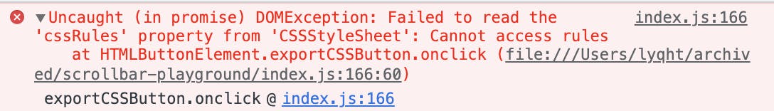
This happens because accessing css rules violates a CORS policy implemented by Google Chrome, and is further discussed in this StackOverflow thread.
Basically, in order to read these rules from the website on your local machine, you have to set up a local testing server. I followed the MDN docs on setting up a local testing server, which just requires to run the below command in bash.
python3 -m http.server
Now, we will be able to access our local website at http:localhost:8000, where we can access stylesheet.cssRules. However, the index.css has other playground layout styles aside from just the scrollbar styles. This meant that we have to perform the following actions:
- We will need to filter them out and get only the scrollbar styles to be exported for the user. Let this be
exportedStyle - We can also help the user to replace the selector
#previewto something more generic likebodyso that they can test it easily on an empty CodePen. So our exported style will look something likelet exportedStyle = 'body { ... }'
This leads to the overall code being
const scrollbarDiv = document.getElementById("preview")
const customProperties = scrollbarDiv.style.cssText
const defaultElementForStyling = "body"

let exportedStyle = `${defaultElementForStyling} { ${customProperties} } `

const cssRules = Object.values(document.styleSheets[1].cssRules)
const scrollbarRules = cssRules.filter(rule => rule.cssText.includes('::-webkit-scrollbar'))
    scrollbarRules.forEach(rule => {
        const modifiedRule = rule.cssText.replace("#preview", defaultElementForStyling)
        exportedStyle += modifiedRule
After we get the exported styles as a string, we want to put them at the user's clipboard so they can paste them to their own project. To do so, we can use the Navigator clipboard Web API.
navigator.clipboard.writeText(exportedStyle)
The clipboard API does not work through an iframe usually, but here's a handy monkey-patch by Thai Pangsakulyanont if you really want it to work on a clipboard. You can refer to the codepen to see how this is added in the
.jsfile.import('https://cdn.skypack.dev/copy-to-clipboard').then(a => navigator.clipboard.writeText = a.default)
In addition to copying to the user's clipboard, we should also show some indicator to tell the user that they did copy the text. For my playground, I added the following text element next to the export button in HTML.
<div id="export-button-container">
    <button id='export-css'>Export CSS</button>
    <p id='export-css-hint'></p>
</div>
Add an initial style to not show this text element
#export-button-container {
    position: relative;
    display: grid;
    place-items: center;
    margin: 16px;
}

#export-button-container>button {
    padding: 12px;
    border-radius: 8px;
}

#export-css-hint {
    opacity: 0;
    color: skyblue;
    left: 60%;
    position: absolute;
    transition: 0.3s;
}
Then after we put the exported styles on the user's clipboard, we can show this text element to fade in, and then fade out after a short while.
const exportCSSHint = document.getElementById('export-css-hint')
navigator.clipboard.writeText(exportedStyle)
exportCSSHint.textContent = 'Copied'
exportCSSHint.style.opacity = 1;
setTimeout(() => {
    exportCSSHint.style.opacity = 0;
}, 1500)
This leads to the final overall code for the export CSS functionality.
const exportCSSButton = document.getElementById('export-css')

exportCSSButton.onclick = async () => {
    let customProperties = scrollbarDiv.style.cssText.length > 0 ? scrollbarDiv.style.cssText : defaultCSSProperties
    let exportedStyle = `${defaultElementForStyling} { ${customProperties} } `
    const cssRules = Object.values(document.styleSheets[1].cssRules) // Google font styles were loaded first before index.css
    const scrollbarRules = cssRules.filter(rule => rule.cssText.includes('::-webkit-scrollbar'))
    scrollbarRules.forEach(rule => {
        const modifiedRule = rule.cssText.replace("#preview", defaultElementForStyling)
        exportedStyle += modifiedRule
    });

    navigator.clipboard.writeText(exportedStyle)
    exportCSSHint.textContent = 'Copied'
    exportCSSHint.style.opacity = 1;
    setTimeout(() => {
        exportCSSHint.style.opacity = 0;
    }, 1500)
}
Great! Now your playground also has the quintessential feature of a generator app ✨ What else is left? Well, the next part will be crucial if you want to work on a playground that allows for raw user input for styling 🚨
3. Validate CSS
This is the third feature which I didn’t include previously in the table of features for playgrounds and generators, it is not commonly thought up of & actually implemented. I couldn't find any guides out there that teaches you how to even do this.
Ideally, when it comes to exporting content for users to use, for a better user experience, we try to make sure that our users don’t even get invalid data e.g. unopenable files, wrong syntax etc. This is because we would be causing trouble for our users who have to spend time to troubleshoot whether it's because they used the exported results wrongly or the exported results are actually invalid.
Hence, it will be great if we could validate our CSS before we give it to the user. For CSS, invalid styles may be exported in a few ways.
- Missing edge case handling due to browser support differences.
- If the user is allowed to pass in raw CSS input through a text input, sometimes the users may be unfamiliar with CSS and give an invalid CSS. Some users may even intentionally give trash input just to test the system.
- The CSS variables could even be updated incorrectly by the developer
e.g. there was once I accidentally removed an additional semicolon in creating the string of exported styles 😆 of course it never made it to production.
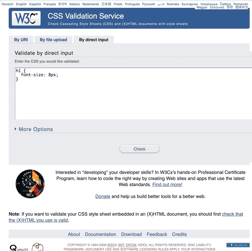
Won’t it be great if there’s a CSS validation service? Well, the official W3C does offer a CSS validation service.
The service works great! However, there are a few problems.
- The website doesn’t make the API documentation very obvious.
- If you look at developer resources, the page for Web Service API only states a single example that follow the SOAP (Simple Object Access Protocol) format.
- To be honest... I haven’t worked with SOAP before despite coding for a few years. I don’t plan to learn it unless I really have to in legacy projects, and I think most of the newer devs wouldn’t know of this format too 😅
- The actual generic API documentation is found under the “Experts only” section of the User Manual. Come on, I don’t need to be an expert to use an API 😂
- The actual output by the API is very verbose. Here’s an example when I tried to call the API via Postman with the default output format of html.
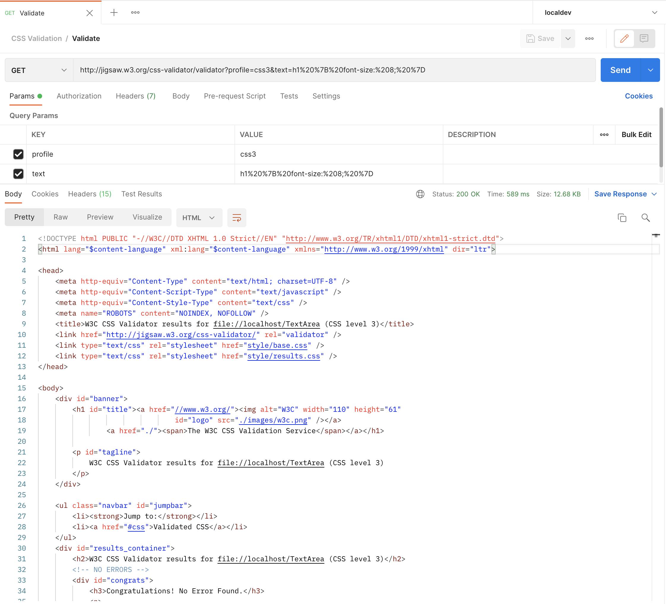
Regardless which output format you choose, be it html/xhtml/soap12/text, all of them will give you similar results.
Luckily, I got some tips from the maintainer of css-validation, Todd Wolfson on how to parse that verbose result. He introduced me to the DOMParser, a Web API.
- With this API, we can parse the HTML document we received from the W3C validation service like a normal HTML.
- Inspecting the HTML, we can also see that there will be
td.errorelements if there are errors.
With these knowledge, we can write a validate CSS function which makes an API call and parse the result for validation errors.
const validateCSS = async (cssStylesInText) => {
    const encodedStyles = encodeURI(cssStylesInText)
    const cssValidationResponse = await fetch(`https://jigsaw.w3.org/css-validator/validator?profile=css3&text=${encodedStyles}`);
    const cssValidationResponseText = await cssValidationResponse.text();
    const parser = new DOMParser();
    const validationDoc = parser.parseFromString(cssValidationResponseText, "text/html")
    const validationErrors = validationDoc.getElementsByClassName("error");
    return validationErrors;
}
Then we can simply check whether there are any validation errors before we give the exported results to the user 🔍 You can throw a toast or whatever to let the user know of the validation errors. For my project, this is unlikely to happen since all of my inputs are controlled so I didn't do that part.
This leads to the overall code for the export CSS functionality + CSS validation.
const validateCSS = async (cssStylesInText) => {
    const encodedStyles = encodeURI(cssStylesInText)
    const cssValidationResponse = await fetch(`https://jigsaw.w3.org/css-validator/validator?profile=css3&text=${encodedStyles}`);
    const cssValidationResponseText = await cssValidationResponse.text();
    const parser = new DOMParser();
    const validationDoc = parser.parseFromString(cssValidationResponseText, "text/html")
    const validationErrors = validationDoc.getElementsByClassName("error");
    return validationErrors;
}

exportCSSButton.onclick = async () => {
    let customProperties = scrollbarDiv.style.cssText
    let exportedStyle = `${defaultElementForStyling} { ${customProperties} } `
    const cssRules = Object.values(document.styleSheets[1].cssRules)
    const scrollbarRules = cssRules.filter(rule => rule.cssText.includes('::-webkit-scrollbar'))
    scrollbarRules.forEach(rule => {
        const modifiedRule = rule.cssText.replace("#preview", defaultElementForStyling)
        exportedStyle += modifiedRule
    });

    const cssValidationErrorsCollection = await validateCSS(exportedStyle)
    if (Object.keys(cssValidationErrorsCollection).length === 0) {
        console.log("No CSS validation errors found by W3C")
        navigator.clipboard.writeText(exportedStyle)
        exportCSSHint.textContent = 'Copied'
        exportCSSHint.style.opacity = 1;
        setTimeout(() => {
            exportCSSHint.style.opacity = 0;
        }, 1500)
    } else {
        console.log({cssValidationErrorsCollection})
        // add your own logic to parse the errors into readable text for your users
    }
}
🎉 We finished the 3rd feature and now, we are done for realz!
If you are keen in CSS validation for testing in web apps that are not pure Vanilla JavaScript, here are 2 libraries you can try out.
- css-validation - a simple library that uses W3C's validation service like what is shown above, and intended to run on NodeJS.
- css-tree/validator - a more advanced library that performs validation via CSSTree parsing, and offers more customization on validation.
Generating playgrounds
After all of that, if you don't want to write less boilerplate code for the configuration logic & styling of the playground itself, there are a few solutions below.
-
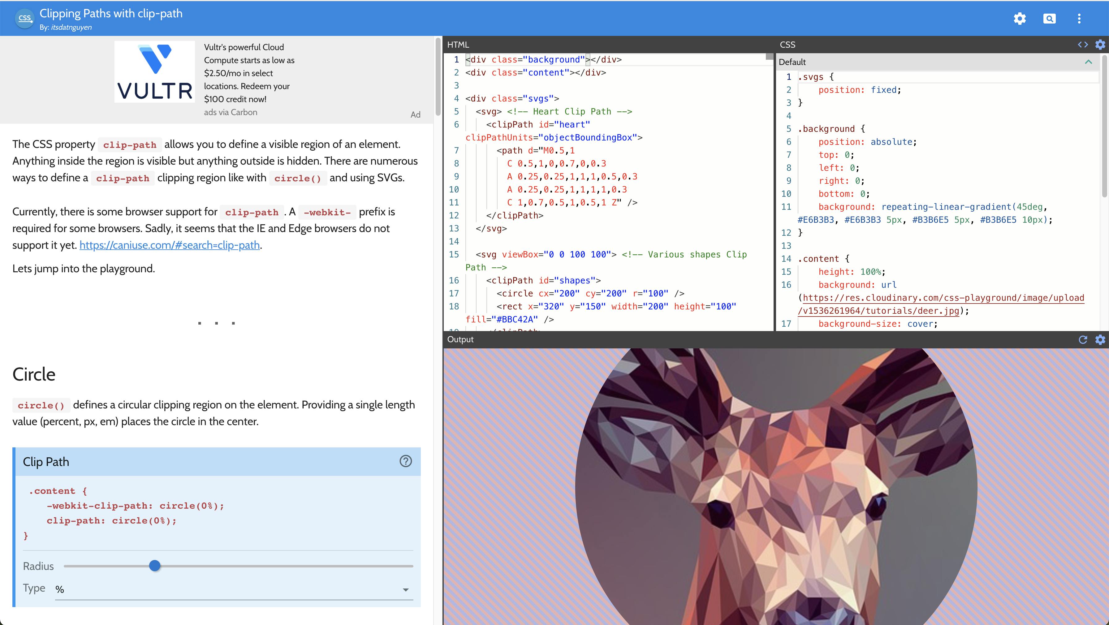
CSS Playground is a website that helps you to generate your own CSS playground. The theme is heavily Material Design, with designated layouts for configs, documentation, etc. Here's an example playground on Clipping Paths with clip-path created by the website maintainer.
-
Storybook is a library that offers many features to help you showcase UI components, particularly that of design systems, which can be implemented on different frontend frameworks e.g. React, Vue, etc. Check out the list of storybook examples.
-
JavaScript Playgrounds is something that I encountered while reading up the reactnative.express guide. The author, Devin Abbott has created a playground component that is designed to be loaded as an iframe for easy inclusion in any webpage. This playground is intended for JavaScript, but could be used for CSS as well, with many configuration options, including React & React Native presets. You can see the playground used all over in the guides that he have made.
Now that you know how to create your own CSS playground from vanilla JavaScript and also possible ways to generate a CSS playground, below is an optional overview on the concept of playgrounds.
The concept of Playgrounds
This section is a short opinionated lore on how playgrounds are helpful and how it is different from a generator. Feel free to skip this if you are not particularly keen in semantics.
The first website that I learnt CSS 5 years ago from was W3C, since it has always been the first search result that shows up in Google. I didn’t know of other resources at that time, but I really liked that for every concept, there is always a “Try it Yourself” button so that I could experiment with what I learnt, however I want. Today, there are more established platforms like CodePen, CodeSandbox, StackBlitz, Expo Snack etc where you get to write code on a browser editor on multiple files and seeing your changes get compiled and rendered on the fly.
With such technology, playgrounds became a norm to help developers learn technical concepts and frameworks better, as they often help to complement information that is difficult to captured by plain text documentation through user interactions. "Playground" is a term often used interchangeably with a "generator" since they could be quite similar in terms of the features they offer, but in the macro perspective, their objective is different.
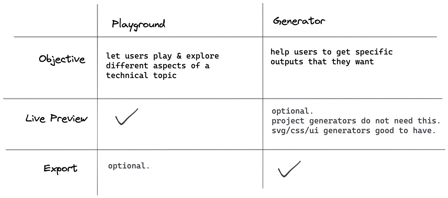
The two have a different value proposition, as such
- There will be a difference in the way the user interface is designed between a playground and a generator app.
- The priority of feature implementation by the developer will also be different.
The value of a generator seem to match more with that of no-code tools, software where users can create their own software products without knowing how to code, as a compared to a playground where the value is to have fun. This is also a reason why I named my project as a playground rather than a generator - the export feature was more of an after-thought rather than planned from the start of the project.
Anyways, now that you understand better the semantic of a playground vs a generator. Below are some references which may help to inspire you to create your own playground or no-code tool. ✨
Idea inspirations
Playgrounds
Specific CSS Generators
Free & Macro CSS generators
Productised Generators
That's a wrap folks! 🎉

Thank you for reading, hope you enjoyed the article! Scrollbar playground is open to feature requests btw. Feel free to create issues and star the project if you find it cool 😊
If you find the article awesome, hit the reactions 🧡 and share it 🐦~
To stay updated whenever I post new stuff, follow me on Twitter.